This project was a challenge because of the sheer amount of information we were dealing with. I suppose that was the point, as an "information design" project.
When I began the project, I had my own conceptions about the trail systems in Des Moines and how users might want to interact with them, as well as the information that was available about them. Therefore, the research I completed through this project was essential. I found a variety of maps online that provided different levels of information. I also explored other digital platforms like apps that have already been created and provide users with similar information to what I wanted to create.
The goal I wanted to accomplish in this project was to create one resource that provides information about the downtown trails in Des Moines, from Gray's Lake on the west to the Des Moines River on the east. It would lay out how the trails connect, and what sort of amenities are available along them (i.e. attractions, restaurants, and parking lots). I believe I achieved a visually pleasing prototype of such an app, but I think there is still much functionality that can be improved upon (with more time and a larger team of researchers and developers!).
Some of the principles from the readings that I was able to employ within the app included "provide options" and "don't reinvent the wheel." I provided options within my app by creating a variety of ways for the user to get to the information they need, and I stuck with the "wheel" that has already been invented by using some of the principles of Material Design.
If I were to enhance this project, I would use Adobe Muse, as some of the functionality I desired was limited by InVision or became too time consuming for the time restraints of this project. The time factor also affected how thorough my research was – I would love to have users test my current product, and through a human-centered design process continue to make iterations until a product is reached that would actually greatly benefit users.
Overall, I learned a lot about the research and thought process that goes into creating information design. It is not about making something you as the designer think is helpful or looks pretty, but about using research to inform the creation of something that is genuinely useful in a beautiful way.
Showing posts with label project 03. Show all posts
Showing posts with label project 03. Show all posts
Wednesday, April 12, 2017

project 03 :: final mockups & site map
Following are some example images of the final state of my app at the time to turn it in.
Click here to view the functioning prototype using InVision.
To make the final formal decisions for this app, I looked into Material Design and utilized their color palette, which was very helpful. The fonts I used were Hind and Nunito, both from Google fonts.


Click here to view the functioning prototype using InVision.
To make the final formal decisions for this app, I looked into Material Design and utilized their color palette, which was very helpful. The fonts I used were Hind and Nunito, both from Google fonts.
 |
| home screen |


Finally, this site map lays out the structure of the app:

Tuesday, April 4, 2017
project 03 :: final critique
Here are some screenshots of the first iteration of my app for our final critique today.


Most of my work so far has been in site mapping and wire framing. I have a solid understanding of the organization of the app, what information will be provided, and how the user will move through the app. Formally, however, this iteration is still very much in its "sketch" stage.
Helpful critique from class today included suggestions to warm up the color palette from so much gray and tighten up the typography. I agree with this and definitely plan to!
Stay tuned for updates!
Tuesday, March 28, 2017
project 03 :: research
I have looked at several different maps, forums, and other online resources to gather information about the trails in Des Moines – specifically the "Downtown Des Moines Trail Loops."


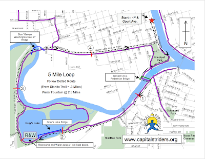




This collection of trails includes Kruidenier Trail (Gray's Lake), Meredith Trail, MLK Trail, and Principal Riverwalk.
Some other maps I found:


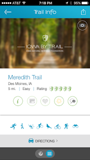
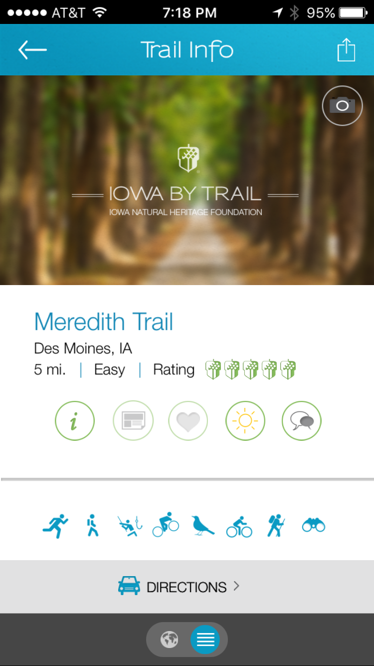
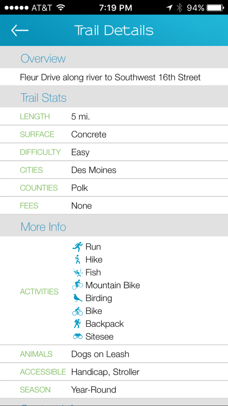
I also downloaded the Iowa by Trail app created by the Iowa Natural Heritage Foundation and Shift Interactive and got some good ideas in how users are used to viewing and interacting with information like the kind I am dealing with. I took note of the placement, size, and organization of the various icons & information.



Google Maps has also been an extremely valuable resource to have an birds-eye view of where each of the paths connect and what parking lots and other attractions are located along each path.


Sunday, March 26, 2017


project 03 :: project statement
The title of this project is Information Design.
We are going to create a way to visualize a set of complex information for the Des Moines bus routes and schedules, Des Moines trails and greenways, or the Des Moines parks and recreation areas.
I have chosen to create an information design for the Des Moines trails and greenways. To narrow down the subject a bit, I intend to focus on the trails in downtown Des Moines specifically. I want to create a resource for college students or young professionals that clearly lays out how the various trails that run through downtown Des Moines are all connected, and how they can be used to get to the most scenic and iconic parts of the city.
We are going to create a way to visualize a set of complex information for the Des Moines bus routes and schedules, Des Moines trails and greenways, or the Des Moines parks and recreation areas.
I have chosen to create an information design for the Des Moines trails and greenways. To narrow down the subject a bit, I intend to focus on the trails in downtown Des Moines specifically. I want to create a resource for college students or young professionals that clearly lays out how the various trails that run through downtown Des Moines are all connected, and how they can be used to get to the most scenic and iconic parts of the city.
project 03 :: reading response 02
Reading response in reference to excerpts from:
Maeda, John. The Laws of Simplicity. 2006. Law 2: Organize, 11-21.
1. According to Maeda, the acronym SLIP stands for Sort, Label, Integrate, and Prioritize. This is a process of deciding "what goes with what." I was pleased to read about this, because last summer I read a book about increasing productivity in workflow, and the author laid out a very similar process! I have since used a process of sorting, labeling, integrating, and prioritizing my everyday tasks and projects using an app on my phone called Todoist, and have found it to be extremely helpful. I will walk through Maeda's SLIP process using my own experience.
First, it is important to SORT each individual piece of information into various categories. For example, if I had a list of tasks that looked like this:
- finish class project
- call Jenna
- clean bathroom
- register for classes
- grocery shopping
- get dinner with Heather
I would sort them into categories, where like goes with like.
- finish class project
- register for classes
- clean bathroom
- grocery shopping
- get dinner with Heather
- call Jenna
Next, I would LABEL the categories. For example:
- School
- finish class project
- register for classes
- Home
- clean bathroom
- Errands
- grocery shopping
- Social
- get dinner with Heather
- call Jenna
Then, I would INTEGRATE some of the categories, to have as few categories as possible. In this case, Home & Errands can probably be consolidated.
- School
- finish class project
- register for classes
- Home
- clean bathroom
- grocery shopping
- Social
- get dinner with Heather
- call Jenna
Finally, I would PRIORITIZE these items by determining which tasks were most important and then setting due dates on them.
2. The sentence that most resonated with me from this reading was:
"Organization makes a system of many appear fewer."For an organizational junkie like me, this is so true. Whether it is a to-do-list, a cluttered room, or files on a computer, whenever these things are organized, it seems like there are fewer items to take care of! And fewer items is less overwhelming.
Wednesday, March 22, 2017
project 03 :: reading response 01
Reading response in reference to excerpts from:
Visocky O’Grady, Jenn and Ken. The Information Design Handbook. 2008.
1. The excerpt from this reading offers helpful information about the differences between an icon, a symbol, and an index.
An icon is a literal visual representation of something. For example, this is an icon of a camera. There is not necessarily a connotation associated with it; it is simply a depiction of a camera.
 |
| http://www.freeiconspng.com/free-images/camera-icon-52 |
On the other hand, a symbol is an abstract representation of something. For example, the Nike logo is a symbol. It is an abstract form associated with the Nike brand, but apart from that association, it has no inherent meaning.
 |
| https://upload.wikimedia.org/wikipedia/commons/thumb/a/a6/Logo_NIKE.svg/2000px-Logo_NIKE.svg.png |
Finally, an index deals with representation by connection. The depiction below of a man and a woman is more than an icon because it is connected with showing people where the restroom is. Therefore, it is an index.
 |
| http://clipart-library.com/clipart/kc8ngXKzi.htm |
2. A new principle or theory that I found interesting from this reading was thinking about wayfinding in terms of points, lines, and planes (pp. 72). This principle says that points are places, landmarks, or signs, lines are perceived boundaries or the paths that lead us from one point to another, and planes are the larger groupings of like information. I think this way of visualizing and thinking conceptually about creating wayfinding resources is helpful!
3. 4 "Quick Tips" from the reading that I want to apply to my information design project:
- Provide help at decision points
- I chose this one because I think it will help me decide where to provide the most useful information within my design. Make sure to target where people will need to make decisions!
- Don't reinvent the wheel
- I want to make sure to conduct research into methods, symbols, icons, and indexes already in place and make efficient use of them within my information design. It will be easier for both me and my users if I capitalize on what already works!
- 70 is the magic number
- I've never heard this idea of 70% contrast being the perfect amount before! This will be helpful, especially if my information design would be implemented outdoors and viewed from a far distance.
- Provide options
- This will be important for me to remember going forward. I want to make sure to accommodate a variety of users by structuring the information in a way that "allows the reader to attain multiple levels of understanding, from overview to expert."
Subscribe to:
Posts (Atom)